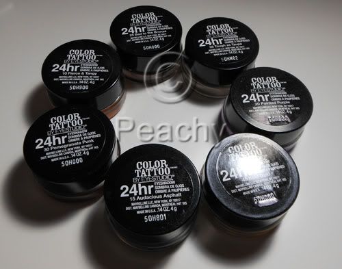
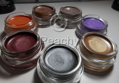
I bought 7 of these: Audacious Asphalt, Bold Gold, Painted Purple, Tough as Taupe, Bad to the Bronze, Fierce and Tangy, and Pomegranate Punk.
These have been compared to MAC's Paint Pots, but to me, the comparison isn't great. The Color Tattoos are both softer and less creamy than PPs, more gel than cream. When I used one of my favorite brushes to apply PPs, the Sonia Kashuk Synthetic Domed brush, it pretty much dug a hole in Tough as Taupe. Of course the colors hardly compare to the permanent line of Paint Pots most of which are neutral colors and used as powder eyeshadow bases. Few of these are neutral and none of them resemble anyone's skin tone. I believe some might be similar to LE PPs, like Artifact and Pomegranate Punk, but I don't have any of them, so I'm not the person to tell you. If you're looking for a cheaper alternative to Paint Pots, a dupe if you will, don't get fooled by the little glass pots, these aren't the same.
So, now that I've got the inevitable Paint Pot comparison out of the way, let's see how these fare on their own merits. They promise 24hr wear; I hate when marketing makes outrageous claims, even if they are based on lab research. These don't last on me, but not a lot does. Some of the Make Up For Ever Aqua Creams do, but not all of them, MAC Paint Pots don't, Benefit Creaseless Cream shadows don't, though I haven't tried those since they reformulated them and ditched all the awesome colors they used to have, UD Primer Potion doesn't make powder shadows last either. I am cursed with oily lids and eyelids that cause a lot of migration (slightly hooded, with really narrow and deep creases). I've barely gotten four hours, let alone twenty four. I've tried on their own, layered with primer, layered with powder shadows, and layered with primer and powder shadow. I've applied with my fingers, flat brushes, fluffy brushes, synthetic brushes, natural hair brushes, a mix. The best results I had were applying with a synethic/natural hair mix fluffy shader brush over NARS Smudgeproof Shadow Base topped with Powder eyeshadow, like here http://www.bepeachy.blogspot.com/2012/03/estee-lauder-mad-men-collection.html. After a few hours, one eye was pretty intact, while the other had creased. I know other people don't have this problem; a friend who suggested Bad to the Bronze wore them all day. I think if things don't normally crease on you, these probably won't either. If you get creasing due to oily or sweaty eyelids, these probably won't crease. If creasing is a regular occurance, even with creaseless products, I think you'll still have creasing with these.
Very few of these products are a swipe-and-done sort of eye look; pretty much Bad to the Bronze the only one I think anyone would feel comfortable with on its own, though I'd wear Audacious Asphalt, too. The rest would likely be used either in conjunction with another or with a powder shadow layered over it. Tough as Taupe is great as a layer beneath any and all taupe shadows, for creating a neutral base underneath warmer shadows, especially if they turn orange on your skin, or for adding depth to the crease. Some of the shimmery shades don't build up well; neither Pomegranate Punk nor Bold Gold were able to be layered to full opacity, as if the act of applying more (with finger or with brush) took off what was already there. I tried an eye look layering the two together and it was an unmitigated disaster. I was actually kind of bummed, as I bought them for that exact look.
It's rather interesting that Maybelline would choose to launch the product with so few "wearable" shades. Most companies have a core color line of neutrals with a few colors thrown in, while these have a teal, a green, a purple, an orange, and a burgundy right from the start. It's lacking "skin tone" colors such as beige, caramel, and brown tones in either shimmery or matte finishes. I think it's a great thing for lovers of colors, but I also think that most women want a simple and pretty look that doesn't require as much thought as most colors require.
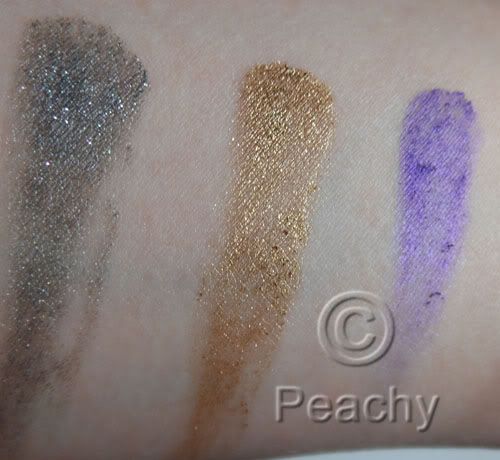 L to R: Audacious Asphalt, Bold Gold, and Painted Purple. Audacious Asphalt is a shimmery gray, it has good payoff and could be used on its own if you like cooler colors. Bold Gold is an almost glittery cool gold. The payoff was lacking and I couldn't layer it to get full opacity. Painted Purple is downright terrible. Very little payoff, an almost lumpy texture, which you can see in the swatch, and what you've already applied disappears as you try to apply more to even it out. That it's a lovely shimmery violet is pretty much irrelevent since it won't actually apply.
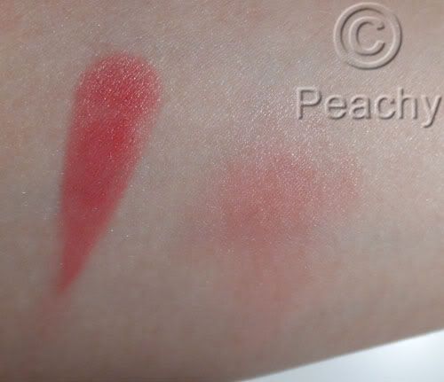
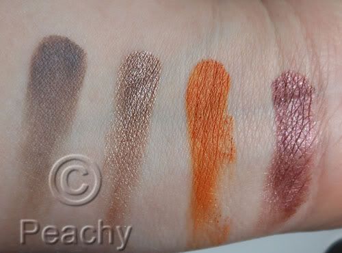 L to R: Tough as Taupe, Bad to the Bronze, Fierce and Tangy, Pomegranate Punk. Tough as Taupe is a matte grayish-taupe. On my skin it's a taupe, but I've heard other people describe it as a cool-toned gray on theirs. It has great payoff. Bad to the Bronze also has great payoff. On me it's a metallic rose-gold shade with a definite warm undertone, but again, I think your skintone varies the color a lot, because on the friend who recommended it it was much more of a golden taupe. Fierce and Tangy is a satin finish golden tangerine shade; there is a small amount of shimmer. It has amazing payoff; it would be the first I'd recommend buying if I thought it was a color most people wanted to wear. Pomegrante Punk is a shimmery to metallic burgundy color; there is a hint of warm brown, especially around the edges. I had trouble layering this one to opacity.
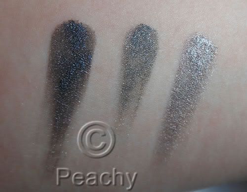
A comparison of MUFE Aqua Cream 1 Anthracite, Audacious Asphalt, and Aqua Cream 2 Steel. Anthracite is much darker, almost black in comparison to AA, while Steel is much more reflective and metallic, lighter, and, though it isn't obvious in this picture due to the reflection, slightly warmer.
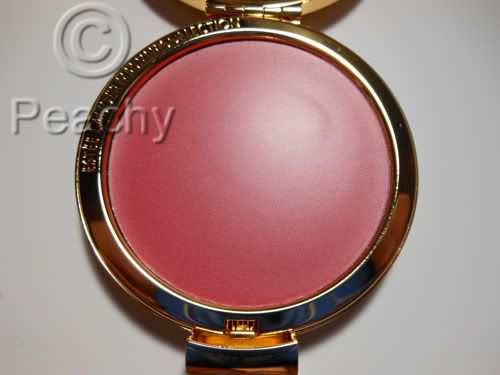
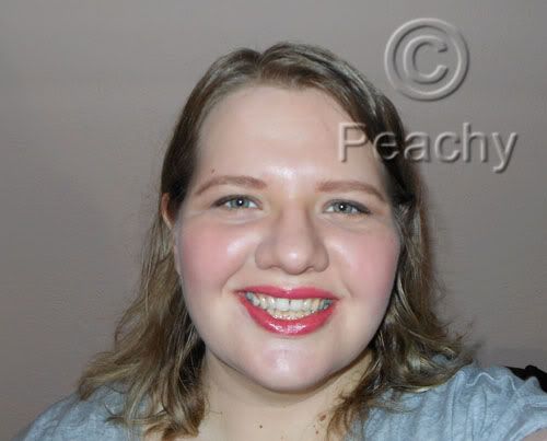
Overall, I'd say these are a step up from most drugstore products, especially where cream eyeshadows are concerned. They vary greatly from color to color, though, and I'd recommend some and not others. I would suggest Bad to the Bronze and Audacious Asphalt, especially if you are looking for a cream shadow you can wear on its own for a simple day look. I'd also recommend Tough as Taupe, especially if you love taupes like I do. I'd also recommend Fierce and Tangy as its the best quality of the seven I have, but only if you want orange eyeshadow. I tried it as a blush and I think it would work only if you have super oily skin or over a rich cream as it just won't blend over the skin. I think Painted Purple should pretty much be taken off the market and reformulated, it's terrible and useless as even an eyeshadow base. The others depend how much you want the colors.