Showing posts with label Review. Show all posts

Monday, July 22, 2013

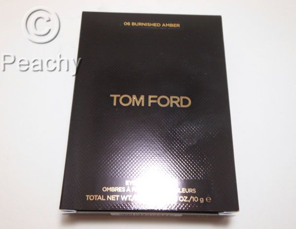
Tom Ford Eye Color Quad Burnished Amber--Review and Swatches

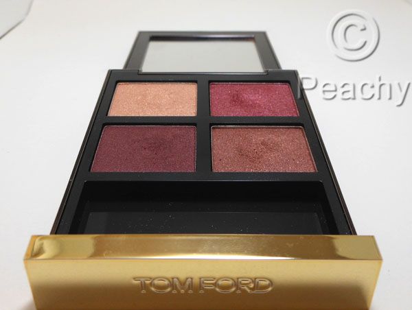
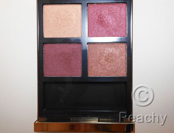
Tom Ford Burnished Amber is my second Tom ford Eye Color Quad.  I know that these eyeshadows have recieved some criticism for their price, as well as the glitteriness and/or shimmeriness of a lot of the shades, but I think this quad is pretty flawless.  For one thing, none of these eye shadows are the sheer glitter-infused texture some don't like.  There are, instead, three shimmery shades and one satin.  One thing that has impressed me about both the quads I have is the color combinations, which are perfectly coordinated. 

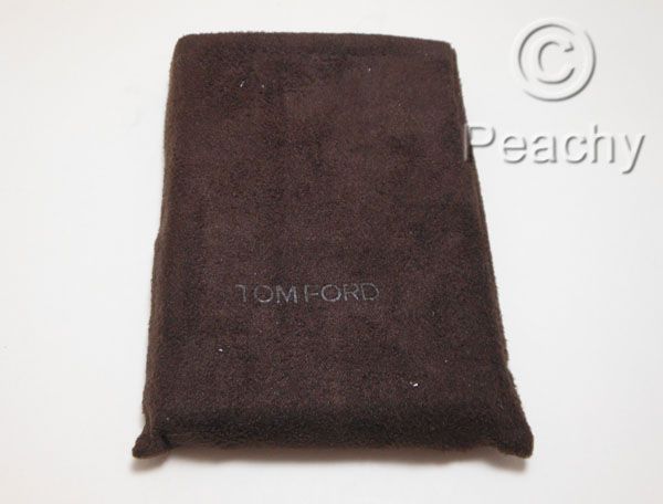
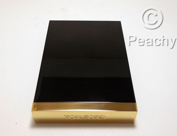
The packaging is, of course, exactly what you would expect for the price, sleek and luxurious. I love the softness of the sleeve and it's good for polishing off fingerprints.  It also has a nice, big mirror, which is nice. 
 
The colors are absolutely perfect together, though unconventional. 
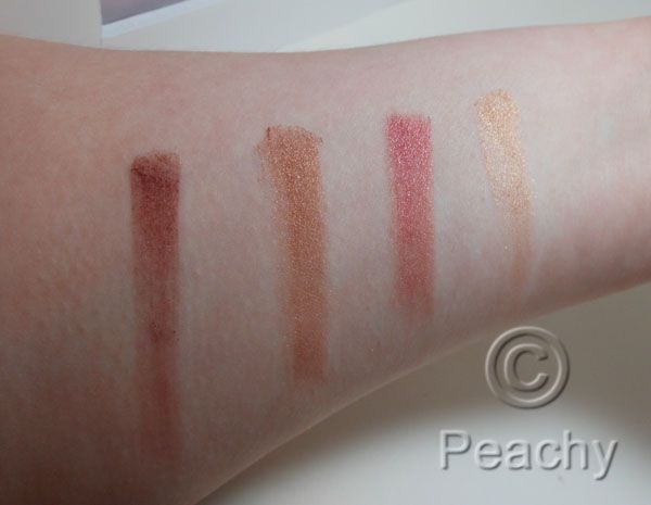
The lightest color is a pale, warm gold with a very shimmery finish.  It's too dark for a highlight on lighter skins, but would be lovely on darker skins.  I use it primarily to blend out the darker bronze color.
The next color is a deep magenta-tinged pink with a shimmer finish.  It's a very rich pink with a good balance of warm and cool tones.  I think even if you don't think you suit pink tones, you'd find this color flattering. 
The next darkest color is a golden bronze with a shimmer finish.  Again, it's not overly warm nor cool.
The darkest color is a dark bordeaux with a satin finish. 
 
The four colors can be used to make a golden look, a pink look, or all four together make a rosy bronze look.  The versatility of this palette is one of its best traits.  The pink-bronze tones make it very flattering to green eyes, which is one of the reasons I love it.  It also suits anyone who looks good in jewel tones, as the richness of the tones would be very flattering.
 
I have heard rumors that this was being discontinued.  It's still in stock as of this post at Neiman Marcus and Bergdorf Goodman online, and I heard this rumor months ago, so I don't know.


OCC Creme Colour Concentrate Review and Swatches

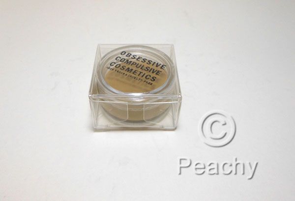
Obsessive Compulsive Cosmetics is a brand I've grown very fond of lately.  Their most well known product is, of course, their lip tars, which are mixable, opaque liquid lip colors that come in unique colors.  Now, OCC has an intense cream product that's suitable for use on eyes, lips, and cheeks.  I bought two of them, Cthulu, a pea green, and Terra Firma, an orangy brown, and fell so desperately in love, I purchased three more, Miriam, John Doe, and Grandma.
The texture of these products is similar to a dense, matte lipstick, and bear resemblance to the Illamasqua cream pigments.  One of the benefits of these is that they are safe for eyes and lips, and they don't crease as badly as the Illamasqua product when used on the eyes (and please note, I am very prone to creasing), though, being cream products, they are prone to creasing.  Topping with a powder shadow or a loose powder will ameliorate that problem.  On cheeks, they're slightly dry, but blendable.  They'd do best either blended onto an emollient base or tapped lightly.  On lips, they are a satin-matte finish, and are quite comfortable to wear. 
What I love most about these are the nuanced and unusual colors, something anyone who's used a Lip Tar has come to expect from OCC.
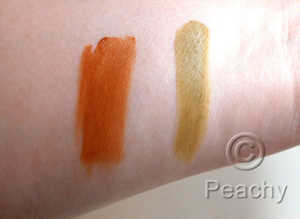
Cthulu is described as a dirty, pale olive.  It is a light pea green shade, with subtle gray and brown undertones.  It's reminiscent of a 70's avocado colored refrigerator, only lighter.
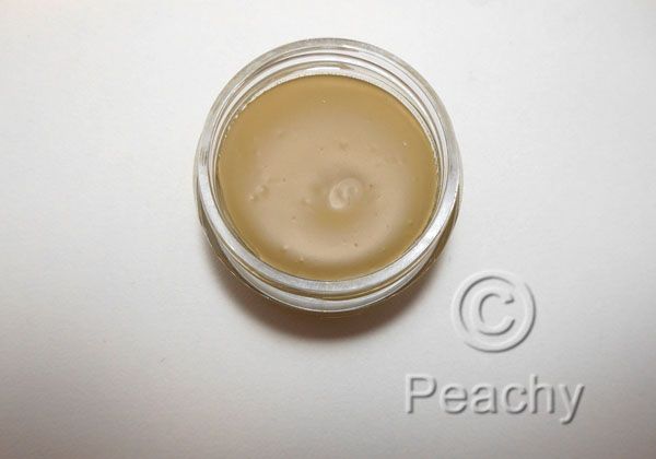
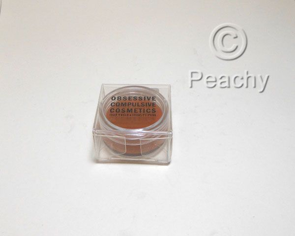
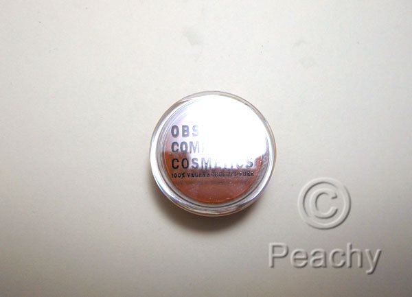
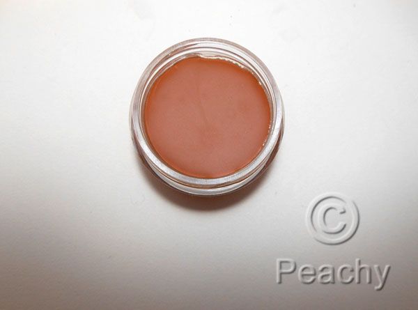
Terra Firma is described as burnt sienna brown.  It's a russet orange-brown shade that would work well on eyes, lips, cheeks, and, while an unusual color, I still think a lot of people would be comfortable wearing it.
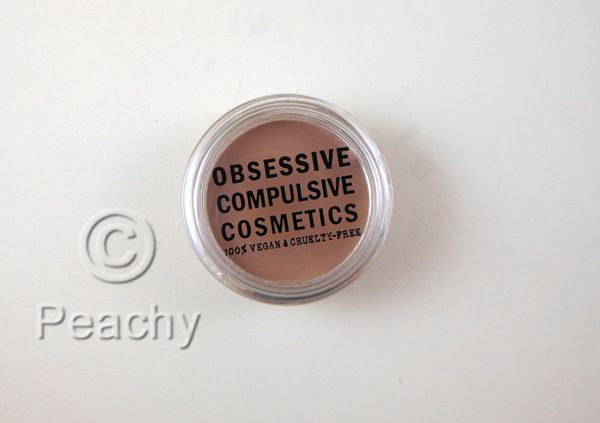
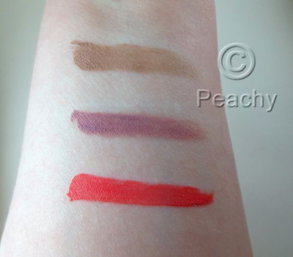
John Doe is described as pale, ash-toned taupe.  It's a very light beige-taupe with strong gray undertones and a hint of yellow.  It's very cool and light, and makes for an excellent cream contour problem on fair skins.  Compared to Illamasqua Hollow, it is cooler and very slightly lighter.
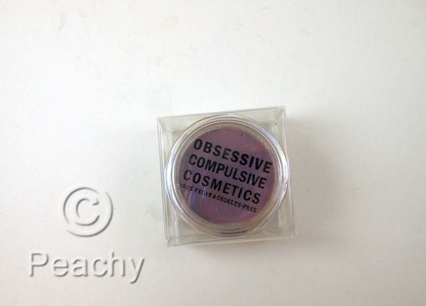
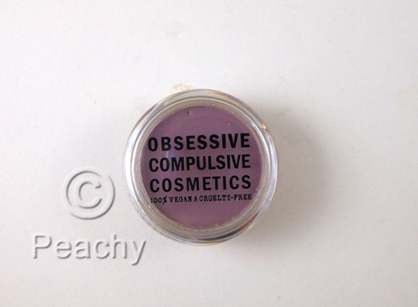
Miriam is described as a subdued, whitened plum.  It is a grayed light purple, leaning mauve, with a bit of pinky warmth.  It's an unusual, but not necessarily unflattering, lip and cheek color.
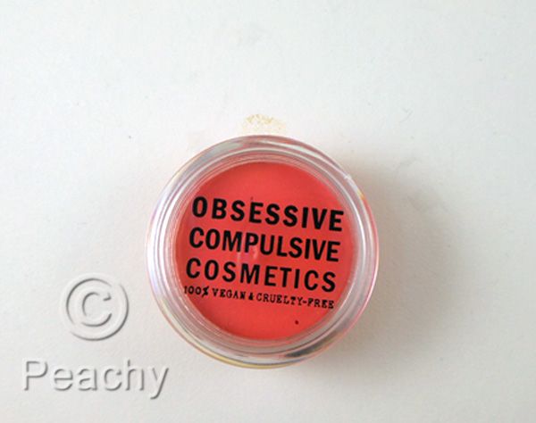
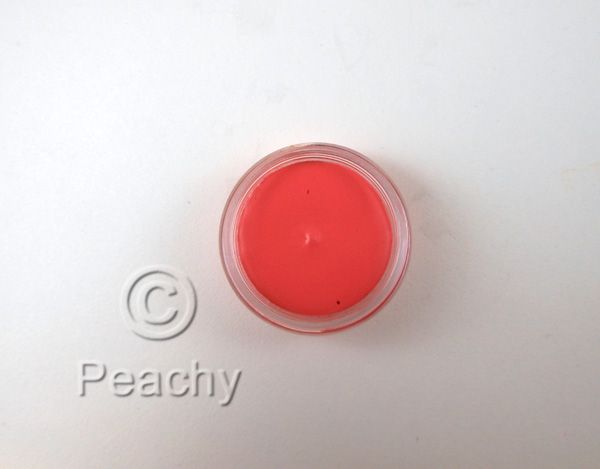
Grandma is described as a clean, classic coral.  It's very similar to the lip tar of the same name, and is a very bright coral with a good balance of bright pink and orange undertones.  To my eye, it leans slightly toward orange, though that would change depending on skin tone and natural lip color.
 
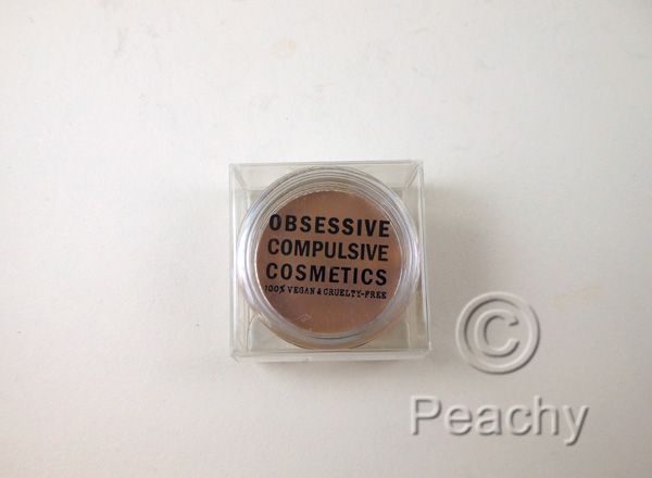
Cthulu
Terra Firma
Swatches of Terra Firma (l) and Cthulu (r)
John Doe
Miriam
Grandma
Swatches of (from top to bottom) John Doe, Miriam, and Grandma.  Grandma appears slightly redder than in real life.
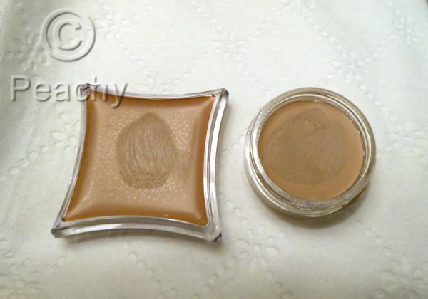
Comparison of Illamasqua Hollow Cream Pigment and John Doe
Swatches of John Doe (left) and Illamasqua Hollow (right).  Sorry I switched them.
As you can see, Hollow is warmer than the ashier John Doe.
 
OCC Creme Colour Concentrates can be purchased form Sephora online or from Obsessive Compulsive Cosmetics.  They retail for $20, which is what I paid for all these suckers.

Saturday, October 13, 2012

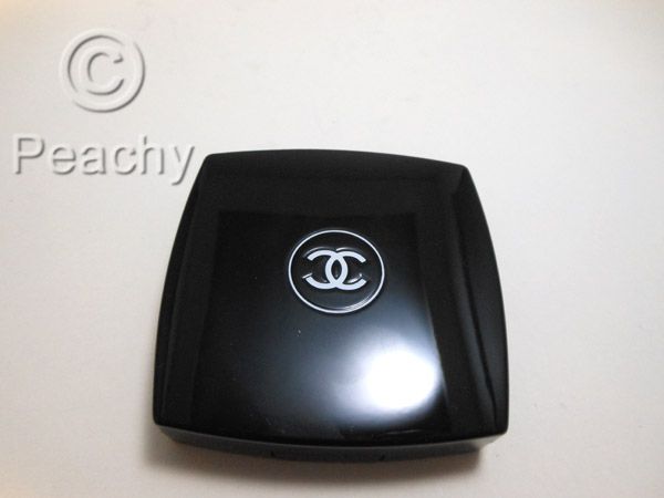
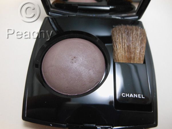
Chanel Notorious Ombre Constraste Sculpting Veil for Eyes and Cheeks

 
Contouring often offers a few problems. Do it wrong and you may end up with orangy-brown stripes along your face. To make it worse, so-called experts often suggest bronzer, as if a product designed to add a sun-kissed glow to skin (not to mention they often have shimmer) would also be the same shade to create natural and flattering shadows. Leave it to Chanel to create one of the few contouring products that leans so cool it's actually a lavender-gray.
It looks like it should be an eyeshadow--and it can be--but aren't we all much more fascinated by its use on the cheeks.  The texture is super powdery.  Just touching my brush, a Hakuhodo large pointed yachiyo, kicked up a bunch of product.  It clung well to the brush, though, and even after dabbing the majority of it onto the back of my hand, I had more than enough product left.  I do suggest applying and blending with a clean brush, reapplying, blending more to gently build up the color, especially on fairer skins.
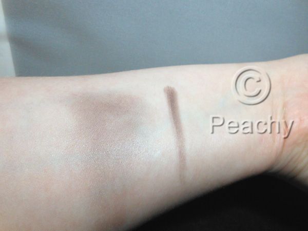
The heavier swatch almost looks purple on my inner arm here, but you can see it blends out to a very natural shadow color.  I think if you find yourself frustrated by the shades of contour available, this might be your answer.  It may look in these pictures that there's shimmer to it, but there's not really.  There's a satiny sheen to it, very skinlike in my opinion.
An incredibly unflattering angle for a cheek swatch--a bit washed out from the flash, too, so I apologize.   
And my full face picture.  I meant to apply an extra coat of concealer under the eyes before I took this picture.  Just look at those bags!  The result of a nasty little head cold, lots of stress, and nowhere near enough sleep.  I used Chanel Notorious as contour under my cheekbones, around my nose, and in my creases and under my eyes.
Face:  Kevin Aucoin Sensual Skin Enhancer SX5, Sephora Microsmooth Powder Light 05 Porcelain.  Make Up For Ever Velvet Finish Compact Powder in 24 in the T-zone.  Tarte Amazonian Clay Long-Wear Blush in Dollface on the cheeks. Chanel Notorious.
Eyes:  Chanel Notorious in the creases and under the eyes, MAC Painterly Paint Pot on the lids, and
Ultraflesh Black Magic Matte wet/dry powder liner on the upper lash line, smudged quite a bit.  Benefit Bad Gal Lash mascara on top and bottom.  Make Up For Ever Aqua Brow in 10.
Lips:  Guerlain Rouge Automatique in 160 Bal de Mai.
 

Saturday, July 21, 2012

Sephora By OPI Why Yellow There, Is It Payday Yet?, and Give Peach a Chance: Pastel Nail Polish swatches

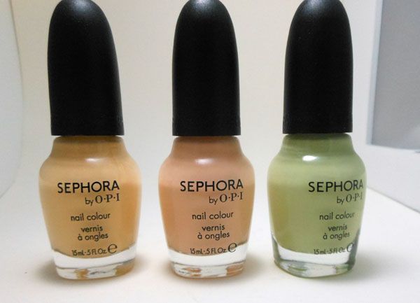
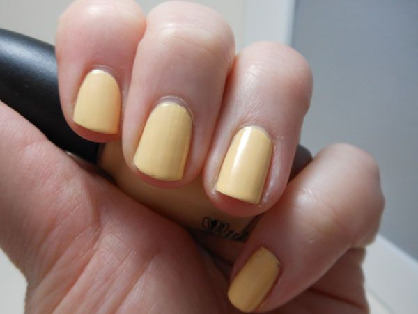
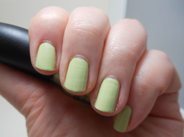
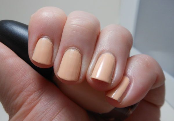
Here are three beautiful pastel Sephora by OPI and some terrible swatches of them.  I have a deep love for yellow nail polishes, especially pastel yellows, and how could Peachy pass up a pastel peach nail polish.  As pastel creams go, these have a terrific formula.  All these swatches are three coats, which I did because my nails are in terrible condition right now.  They would certainly be opaque in two if you have nice nails or use a ridge filling basecoat to smooth things out, which I did not.  They weren't streaky at all and the wide brush SOPI has switched to works well for these to further prevent streaks.  I pretty much did one stroke for each nail, instead of my usual three.

Why Yellow There
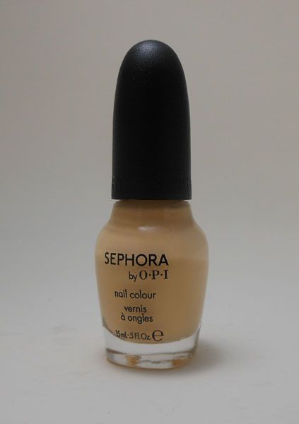
A beautiful buttery pastel yellow.  It's a great warm pastel yellow--Sephora aptly calls it buttercream--which is nice because most pastel yellows I find are citrusy, cool green toned yellows.  This might be my dream polish, and it applies like a dream.  Forget the cliche of terrible to apply yellow polishes, this is not one of them. 

Is It Payday Yet?
I don't need to keep raving about the formula, do I?  This one dried a little darker than in the bottle, but it's a pale lime green either way.  Another great color description from Sephora, as this one is described as key lime pie.  Yummy! 

Give Peach a Chance
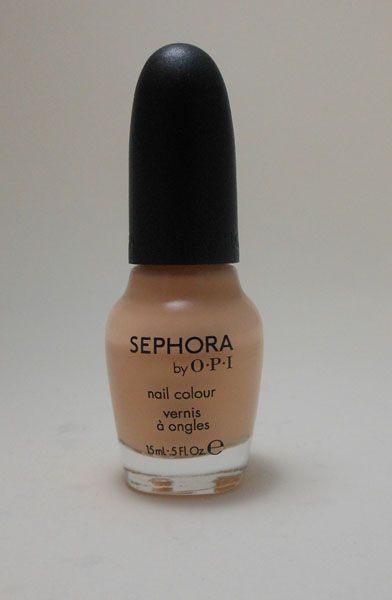
I love it when Sephora by OPI or OPI has a cute polish name, on account of the cringeworthiness of most of them, but how can you not love "Give Peach a Chance."  This one is a super pale peach; Sephora describes it as nude peach, which I don't really see.  It's not an overly pink peach, it has a nice yellow base, but is pretty neutral, so maybe that's what they mean.  I think it could work as a conservative workplace color without being dull or blah.  I really want to try my first gradient with the three of these.  I'll post pics if I do.

I totally forgot to watermark all these pictures.

Saturday, June 16, 2012

Tokyomilk Dark Lip Elixirs

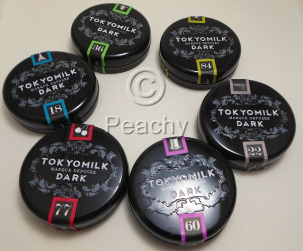
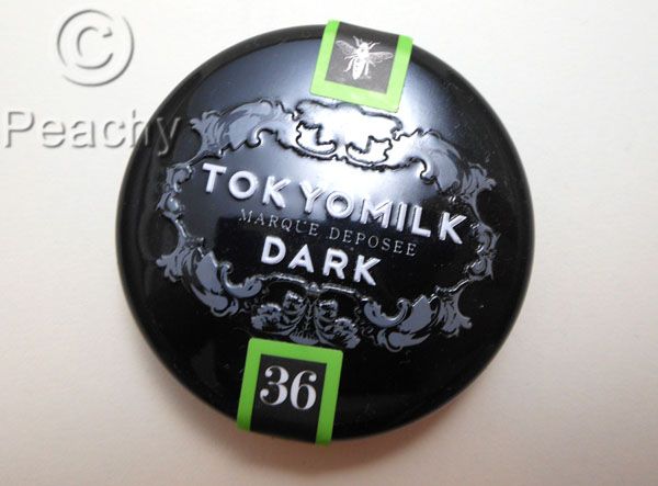
Tokyomilk Dark's lip elixer is not only my favorite lip balm of the moment, it's also one of my favorite products of all time.  To say I'm obsessed is an understatement; just look at the picture above--I currently own six out of eight of them.  The only ones I don't currently have are Dead Sexy, which I've never tried, and La Vie en Rose, which I gave to my mother.  The scents and flavors of these beauties are unusual, delicious, practically made for me.  I will try to control the gushing as I review the six presented here.
They come packaged in a gorgeous, metal tin, with raised lettering and design.  They can be hard to open, especially after they've clattered aroudn in purse.  They are originally sealed with a plastic band around the edge and a paper label across the middle.  This label is the only place with the flavor written on it, so I suggest you cut it, as I did, instead of peeling it off.  I love pot lip balms, mostly because they tend to be softer than sticks.  I know a lot of people worry about hygiene, but I am careful to only stick clean fingers in and not double dip, so I'm not worried.
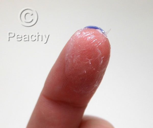
Just look at that thick, luscious balm!  Don't you  just want to stick your finger in that?!?
Okay, so it's not the prettiest picture, but nobody's perfect, even though this comes close. 

Lip Elixirs are thick, they're a petrolatum and microcystalline wax base.  I know a lot of people don't like petroleum jelly, but I have always loved balms based on it: Kiehl's, Rosebud Salve.  Waxy lipbalms, like Burt's Bee's have always sat on top of my lips and never spread well.  This stuff, however, balances both petrolatum and wax in the formula, so the texture is neither overly petrolatum-y nor waxy.  It's like if the Kiehl's lip balm and the Burt's Bee's lip balm had a baby that was raised by Jack Black's lip balm. 
The ingredients, as listed on Cherry Bourbon, are:  petrolatum, microcrystal wax, flavor, canola ooil and oil barbadensis (aloe vera) leaf extract, tocopherol (vitamin E), tocopheryl (Vitamin E) acetate, stevia rebaudiana (Stevia) leaf extract, organic camellia sinensis (green tea) leaf extract, carthamus tinctorius (safflower) seed oil and jasminum officinale (jasmine) flower extract, monarda didyma (bee balm) leaf extract. 
I get a lot of moisture from them, and I do lean towards dry lips.  Actually, I ended up with most of them because my wonderful sister took pity on me and gifted me with five of them after my lip split open when I smiled.  They are also very protective; you can lip your lips--and you will want to--and they will still be on.  Now, on to the important stuff--how do they smell and taste.
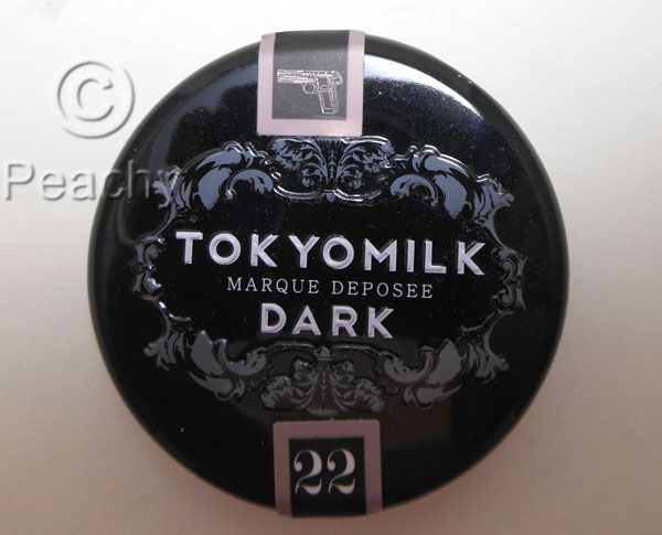
No. 22 Smoked Salt
Flavor Notes: Smoked Sea Salt, Burnt Sugar, Molasses, Vanilla Bean (as per their website)
On first sniff, there is overwhelming smoke.  It's not a woody smoke, though.  After a few minutes, I start to get salt and a background of burnt sugar or molasses.  I never smell vanilla bean.  I think the smokiness would turn a lot of people away, but I kind of like it.
The flavor isn't really smoky at all.  The sweetness from the stevia dominates.  I get the burnt sugar and molasses notes and that's it.
This one is the most controversial, but it's unusual and if you like the smell of smoke, I think you will love it.  It's not my favorite, though.
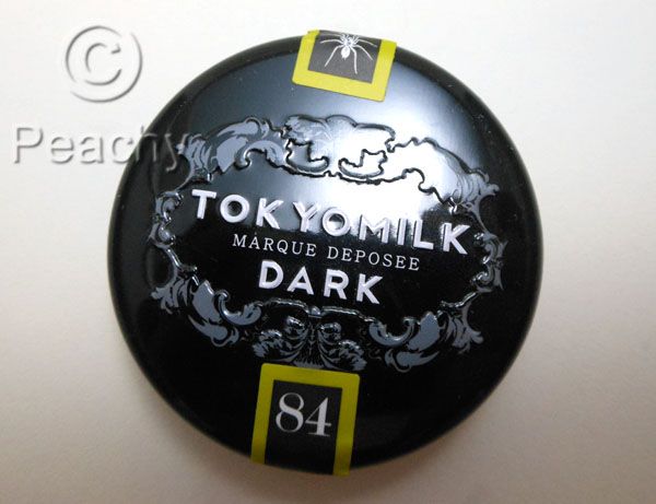
No. 84 Absinthe
Flavor Notes: Anise, Mineral Salt, Citrus Peel, Crushed Herbs
How cool is it that there's an absinthe flavor!  The scent is the most waxy smelling at first, and I don't really get absinthe (though I keep meaning to smell my sister's bottle when I'm at her house).  I get some citrus, maybe a touch of the anise most associated with absinthe.  It's familiar, but I can't place it.  It's quite lovely, though, and probably one of the coolest scents/flavors in my opinion.
Flavorwise, I definitely get absinthe.  That licorice-y anise flavor and the sweetness reminiscent of a glass of absinthe with a sugar cube dominate.  It's damn awesome, and would be my favorite if it weren't for the fact that this flavor and this flavor alone makes my lips burn and itch.  Sad face.
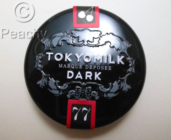
No. 77 Cherry Bourbon
Flavor Notes: Cherry Brandy, Whiskey, Aged Wood, Clove
I smell cherry, whiskey, and that beautiful background of wood.  This one is very true to it's intended flavor notes.  Deep and rich and beautifully balanced.  I think cherry brandy is a great description of the cherry flavor, it's not candyish, nor overly fruity, and the whole thing if reminscent of a great glass of aged alcohol.
The flavor is really similar to the scent.  Rich and sweet with cherry notes and an aged bourbon whiskey. 
No. 36 Salted Caramel
Flavor Notes: Sweet Cream, Sea Salt, Caramelized Sugar, Toasted Vanilla Bean
The scent is instantly and recognizably buttery caramel.  More reminiscent of caramel popcorn than a fine candy, though.  After a few sniffs, the scent becomes deeper, more vanilla and more burnt sugar.
The taste is less buttery, more mellow caramely and salty.  It tastes like dessert, and I think it would be great if you want to try one and are scared of Smoked Salt or Clove Cigarette.  Delicious!
No. 60 Coco Noir
Flavor Notes: Dark Rum, Maraschino Cherry, Sweet Milk, Cacao Bean
The opening scent note is cocoa--super dark and kind of bitter--which is slightly artificial smelling and maraschino cherry.  It's a different scent of cherry than in the Cherry Bourbon, less alcoholic and more candy, which suits the note description of Maraschino cherry. 
It's tastes mostly of cherry, too, with the chocolate no longer strong nor artificial.  It seems there is less Stevia in the flavor, so it's not as sweet as the Salted Caramel or the absinthe.  This is definitely for the lover of chocolate covered cherries.
No. 18 Clove Cigarettes
Flavor Notes: Crushed Clove, Lavender Rose, Saigon Cinnamon, Vanilla Bean
Clove and cinnamon definitely dominate the scent, and I get just a hint of smokiness.  It's luscious and spicy.
The balance between the sweetness of the stevia and the flavor of the cloves is perfect.  It tastes nothing like sticking your head in the spice cabinet, fortunately.  This is undeniably my favorite flavor.  It's warm and sweet, but still super cool.  It's less your grandmother's cookies and more rebellious seventh grade smoking clove cigarettes in the girls' bathroom.  My imaginary junior high is much cooler than my real one was. 
Sephora sells three of them: La Vie En Rose, Salted Caramel and Clove Cigarette, and the rest are available from Tokyomilk's website.  All are seven dollars for .7 oz.

Wednesday, March 7, 2012

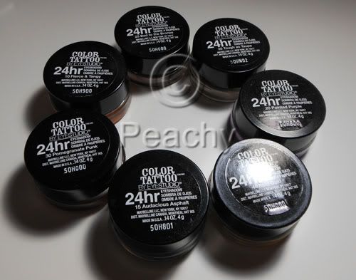
Maybelline Color Tattoo 24hr Cream Gel Shadow Review and Swatches


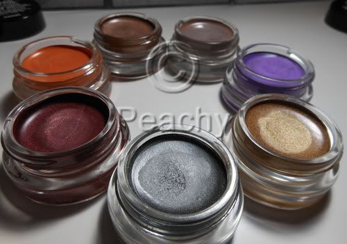
I bought 7 of these: Audacious Asphalt, Bold Gold, Painted Purple, Tough as Taupe, Bad to the Bronze, Fierce and Tangy, and Pomegranate Punk.
These have been compared to MAC's Paint Pots, but to me, the comparison isn't great. The Color Tattoos are both softer and less creamy than PPs, more gel than cream. When I used one of my favorite brushes to apply PPs, the Sonia Kashuk Synthetic Domed brush, it pretty much dug a hole in Tough as Taupe. Of course the colors hardly compare to the permanent line of Paint Pots most of which are neutral colors and used as powder eyeshadow bases. Few of these are neutral and none of them resemble anyone's skin tone. I believe some might be similar to LE PPs, like Artifact and Pomegranate Punk, but I don't have any of them, so I'm not the person to tell you. If you're looking for a cheaper alternative to Paint Pots, a dupe if you will, don't get fooled by the little glass pots, these aren't the same.

So, now that I've got the inevitable Paint Pot comparison out of the way, let's see how these fare on their own merits. They promise 24hr wear; I hate when marketing makes outrageous claims, even if they are based on lab research. These don't last on me, but not a lot does. Some of the Make Up For Ever Aqua Creams do, but not all of them, MAC Paint Pots don't, Benefit Creaseless Cream shadows don't, though I haven't tried those since they reformulated them and ditched all the awesome colors they used to have, UD Primer Potion doesn't make powder shadows last either. I am cursed with oily lids and eyelids that cause a lot of migration (slightly hooded, with really narrow and deep creases). I've barely gotten four hours, let alone twenty four. I've tried on their own, layered with primer, layered with powder shadows, and layered with primer and powder shadow. I've applied with my fingers, flat brushes, fluffy brushes, synthetic brushes, natural hair brushes, a mix. The best results I had were applying with a synethic/natural hair mix fluffy shader brush over NARS Smudgeproof Shadow Base topped with Powder eyeshadow, like here http://www.bepeachy.blogspot.com/2012/03/estee-lauder-mad-men-collection.html. After a few hours, one eye was pretty intact, while the other had creased. I know other people don't have this problem; a friend who suggested Bad to the Bronze wore them all day. I think if things don't normally crease on you, these probably won't either. If you get creasing due to oily or sweaty eyelids, these probably won't crease. If creasing is a regular occurance, even with creaseless products, I think you'll still have creasing with these.

Very few of these products are a swipe-and-done sort of eye look; pretty much Bad to the Bronze the only one I think anyone would feel comfortable with on its own, though I'd wear Audacious Asphalt, too. The rest would likely be used either in conjunction with another or with a powder shadow layered over it. Tough as Taupe is great as a layer beneath any and all taupe shadows, for creating a neutral base underneath warmer shadows, especially if they turn orange on your skin, or for adding depth to the crease. Some of the shimmery shades don't build up well; neither Pomegranate Punk nor Bold Gold were able to be layered to full opacity, as if the act of applying more (with finger or with brush) took off what was already there. I tried an eye look layering the two together and it was an unmitigated disaster. I was actually kind of bummed, as I bought them for that exact look.

It's rather interesting that Maybelline would choose to launch the product with so few "wearable" shades. Most companies have a core color line of neutrals with a few colors thrown in, while these have a teal, a green, a purple, an orange, and a burgundy right from the start. It's lacking "skin tone" colors such as beige, caramel, and brown tones in either shimmery or matte finishes. I think it's a great thing for lovers of colors, but I also think that most women want a simple and pretty look that doesn't require as much thought as most colors require.


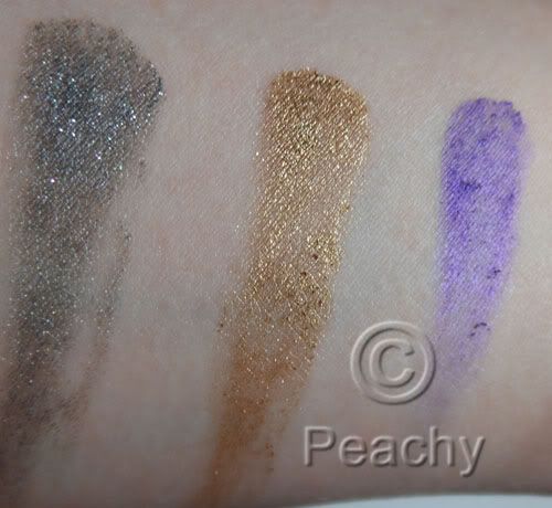
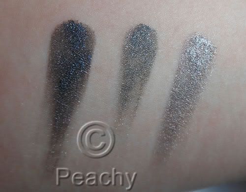
L to R: Audacious Asphalt, Bold Gold, and Painted Purple. Audacious Asphalt is a shimmery gray, it has good payoff and could be used on its own if you like cooler colors. Bold Gold is an almost glittery cool gold. The payoff was lacking and I couldn't layer it to get full opacity. Painted Purple is downright terrible. Very little payoff, an almost lumpy texture, which you can see in the swatch, and what you've already applied disappears as you try to apply more to even it out. That it's a lovely shimmery violet is pretty much irrelevent since it won't actually apply.
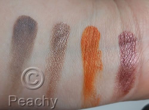
L to R: Tough as Taupe, Bad to the Bronze, Fierce and Tangy, Pomegranate Punk. Tough as Taupe is a matte grayish-taupe. On my skin it's a taupe, but I've heard other people describe it as a cool-toned gray on theirs. It has great payoff. Bad to the Bronze also has great payoff. On me it's a metallic rose-gold shade with a definite warm undertone, but again, I think your skintone varies the color a lot, because on the friend who recommended it it was much more of a golden taupe. Fierce and Tangy is a satin finish golden tangerine shade; there is a small amount of shimmer. It has amazing payoff; it would be the first I'd recommend buying if I thought it was a color most people wanted to wear. Pomegrante Punk is a shimmery to metallic burgundy color; there is a hint of warm brown, especially around the edges. I had trouble layering this one to opacity.
A comparison of MUFE Aqua Cream 1 Anthracite, Audacious Asphalt, and Aqua Cream 2 Steel. Anthracite is much darker, almost black in comparison to AA, while Steel is much more reflective and metallic, lighter, and, though it isn't obvious in this picture due to the reflection, slightly warmer.
Overall, I'd say these are a step up from most drugstore products, especially where cream eyeshadows are concerned. They vary greatly from color to color, though, and I'd recommend some and not others. I would suggest Bad to the Bronze and Audacious Asphalt, especially if you are looking for a cream shadow you can wear on its own for a simple day look. I'd also recommend Tough as Taupe, especially if you love taupes like I do. I'd also recommend Fierce and Tangy as its the best quality of the seven I have, but only if you want orange eyeshadow. I tried it as a blush and I think it would work only if you have super oily skin or over a rich cream as it just won't blend over the skin. I think Painted Purple should pretty much be taken off the market and reformulated, it's terrible and useless as even an eyeshadow base. The others depend how much you want the colors.