Wednesday, March 7, 2012

Maybelline Color Tattoo 24hr Cream Gel Shadow Review and Swatches


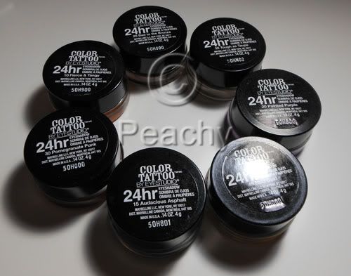
I bought 7 of these: Audacious Asphalt, Bold Gold, Painted Purple, Tough as Taupe, Bad to the Bronze, Fierce and Tangy, and Pomegranate Punk.

These have been compared to MAC's Paint Pots, but to me, the comparison isn't great. The Color Tattoos are both softer and less creamy than PPs, more gel than cream. When I used one of my favorite brushes to apply PPs, the Sonia Kashuk Synthetic Domed brush, it pretty much dug a hole in Tough as Taupe. Of course the colors hardly compare to the permanent line of Paint Pots most of which are neutral colors and used as powder eyeshadow bases. Few of these are neutral and none of them resemble anyone's skin tone. I believe some might be similar to LE PPs, like Artifact and Pomegranate Punk, but I don't have any of them, so I'm not the person to tell you. If you're looking for a cheaper alternative to Paint Pots, a dupe if you will, don't get fooled by the little glass pots, these aren't the same.

So, now that I've got the inevitable Paint Pot comparison out of the way, let's see how these fare on their own merits. They promise 24hr wear; I hate when marketing makes outrageous claims, even if they are based on lab research. These don't last on me, but not a lot does. Some of the Make Up For Ever Aqua Creams do, but not all of them, MAC Paint Pots don't, Benefit Creaseless Cream shadows don't, though I haven't tried those since they reformulated them and ditched all the awesome colors they used to have, UD Primer Potion doesn't make powder shadows last either. I am cursed with oily lids and eyelids that cause a lot of migration (slightly hooded, with really narrow and deep creases). I've barely gotten four hours, let alone twenty four. I've tried on their own, layered with primer, layered with powder shadows, and layered with primer and powder shadow. I've applied with my fingers, flat brushes, fluffy brushes, synthetic brushes, natural hair brushes, a mix. The best results I had were applying with a synethic/natural hair mix fluffy shader brush over NARS Smudgeproof Shadow Base topped with Powder eyeshadow, like here http://www.bepeachy.blogspot.com/2012/03/estee-lauder-mad-men-collection.html. After a few hours, one eye was pretty intact, while the other had creased. I know other people don't have this problem; a friend who suggested Bad to the Bronze wore them all day. I think if things don't normally crease on you, these probably won't either. If you get creasing due to oily or sweaty eyelids, these probably won't crease. If creasing is a regular occurance, even with creaseless products, I think you'll still have creasing with these.

Very few of these products are a swipe-and-done sort of eye look; pretty much Bad to the Bronze the only one I think anyone would feel comfortable with on its own, though I'd wear Audacious Asphalt, too. The rest would likely be used either in conjunction with another or with a powder shadow layered over it. Tough as Taupe is great as a layer beneath any and all taupe shadows, for creating a neutral base underneath warmer shadows, especially if they turn orange on your skin, or for adding depth to the crease. Some of the shimmery shades don't build up well; neither Pomegranate Punk nor Bold Gold were able to be layered to full opacity, as if the act of applying more (with finger or with brush) took off what was already there. I tried an eye look layering the two together and it was an unmitigated disaster. I was actually kind of bummed, as I bought them for that exact look.

It's rather interesting that Maybelline would choose to launch the product with so few "wearable" shades. Most companies have a core color line of neutrals with a few colors thrown in, while these have a teal, a green, a purple, an orange, and a burgundy right from the start. It's lacking "skin tone" colors such as beige, caramel, and brown tones in either shimmery or matte finishes. I think it's a great thing for lovers of colors, but I also think that most women want a simple and pretty look that doesn't require as much thought as most colors require.
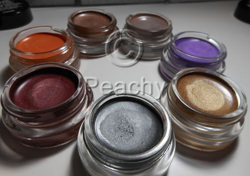
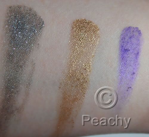
L to R: Audacious Asphalt, Bold Gold, and Painted Purple. Audacious Asphalt is a shimmery gray, it has good payoff and could be used on its own if you like cooler colors. Bold Gold is an almost glittery cool gold. The payoff was lacking and I couldn't layer it to get full opacity. Painted Purple is downright terrible. Very little payoff, an almost lumpy texture, which you can see in the swatch, and what you've already applied disappears as you try to apply more to even it out. That it's a lovely shimmery violet is pretty much irrelevent since it won't actually apply.
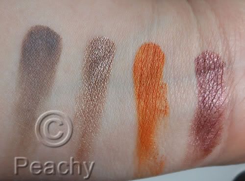
L to R: Tough as Taupe, Bad to the Bronze, Fierce and Tangy, Pomegranate Punk. Tough as Taupe is a matte grayish-taupe. On my skin it's a taupe, but I've heard other people describe it as a cool-toned gray on theirs. It has great payoff. Bad to the Bronze also has great payoff. On me it's a metallic rose-gold shade with a definite warm undertone, but again, I think your skintone varies the color a lot, because on the friend who recommended it it was much more of a golden taupe. Fierce and Tangy is a satin finish golden tangerine shade; there is a small amount of shimmer. It has amazing payoff; it would be the first I'd recommend buying if I thought it was a color most people wanted to wear. Pomegrante Punk is a shimmery to metallic burgundy color; there is a hint of warm brown, especially around the edges. I had trouble layering this one to opacity.
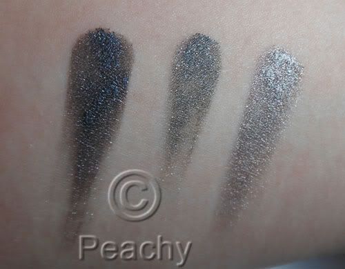
A comparison of MUFE Aqua Cream 1 Anthracite, Audacious Asphalt, and Aqua Cream 2 Steel. Anthracite is much darker, almost black in comparison to AA, while Steel is much more reflective and metallic, lighter, and, though it isn't obvious in this picture due to the reflection, slightly warmer.
Overall, I'd say these are a step up from most drugstore products, especially where cream eyeshadows are concerned. They vary greatly from color to color, though, and I'd recommend some and not others. I would suggest Bad to the Bronze and Audacious Asphalt, especially if you are looking for a cream shadow you can wear on its own for a simple day look. I'd also recommend Tough as Taupe, especially if you love taupes like I do. I'd also recommend Fierce and Tangy as its the best quality of the seven I have, but only if you want orange eyeshadow. I tried it as a blush and I think it would work only if you have super oily skin or over a rich cream as it just won't blend over the skin. I think Painted Purple should pretty much be taken off the market and reformulated, it's terrible and useless as even an eyeshadow base. The others depend how much you want the colors.

Mad Men Lipstick Comparison Swatches

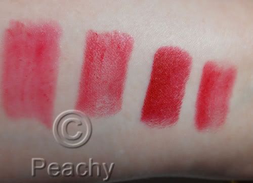
From L to R: MAC Lady Danger, Revlon Fire and Ice, Estee Lauder MM Cherry, Laura Mercier Mistress (which I think is discontinued). I thought it would be close to LM Mistress, which is a pinkish red, and I bought because I read that it was used on Mad Men, but you can see it's more red than Cherry.
L to R: Estee Lauder MM Cherry, MAC Brave Red, MAC Russian Red, MAC Ruby Woo. Brave Red is the closest of this quartet, but it's much redder, very tomato-y in comparison.


L to R: Tarte Lipsurgence in Lust, Estee Lauder MM Cherry, Guerlain Rouge Automatique 120 Coq d'Or, Estee Lauder MM Cherry, Poppy King for Boots No. 7 Glamour.  Both the Tarte and the Guerlain have a similar finish the Tarte being slightlier shinier, and the Guerlain being less shiny but having a slight shimmer, but both are redder, while the No. 7 is obviously pink.

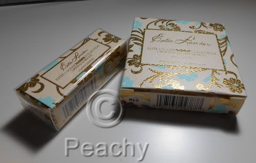
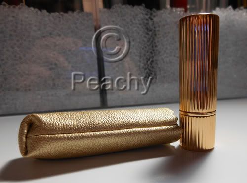
But let's face it, if you're going to buy the Estee Lauder, it's not going to be for the color, it's going to be for the packaging and the marketing.

Edited: Fixed and combined the last picture.  After much debate, I decided I had mislabeled the comparison with the RA, and I've had this picture ready for months.

Estee Lauder Mad Men Collection Review and Swatches

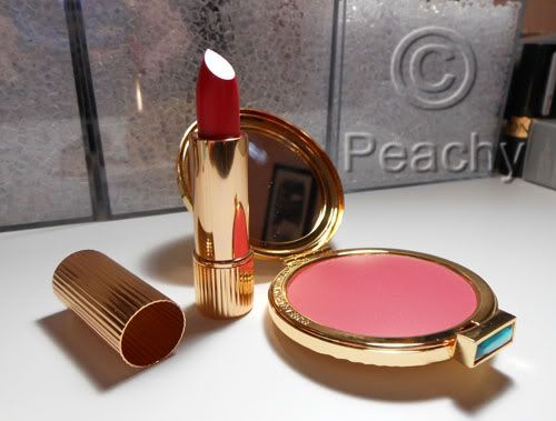
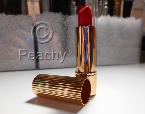
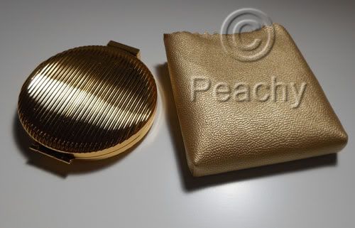
Since I am a bit of a Mad Men nut, and a vintage makeup nut, I needed this collection: a cream blush in "Evening Rose" and a lipstick in "Cherry" in gorgeous, special edition vintage Estee Lauder inspired packaging.

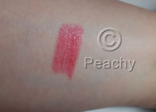
The lipstick is tiny, but exquisitely elegant in old-fashioned metal packaging. The color is a reddish-pink, with a shiny, slightly sheer texture (somewhat similar to a MAC Lustre finish I'd say) and the staying power was about to expected from such a texture; in other words, not great. It wore away in the center, leaving an outline around the rest of my lips. I used no lipliner because that would do no one any good.

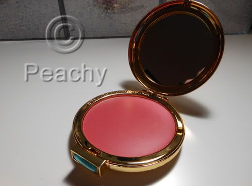
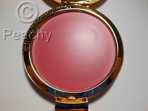
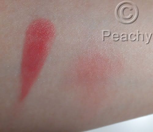
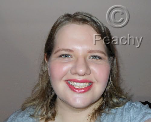
The blush is better, I'd say. It's housed in what looks like a small vintage compact; the clasp is a lovely blue jewel. The texture is very soft, lighter than a Stila Convertible Color, for instance. I had great color payoff, for both the swatch and on my cheeks. The color is a warm rose-pink. I'd say there's the tiniest touch of coral, but the overall color is a rosy-pink. It was pretty buildable color, but blended well into the skin. I genuinely loved it, but I'm a sucker for blush, and it has pretty much everything I like in a blush.


Other products used: Bobbi Brown Foundation Stick in Porcelain, Benefit Eye Bright under the eyes, Maybelline Color Tattoo in "Bad to the Bronze" layered with both shades from NARS Kalahari duo, MAC Fluidline in Avenue, Smashbox Lash DNA Mascara, MAC Lingering Eye Brows and Brow Set in Beguile, and Laura Mercier Translucent Loose Powder. It was a quick and dirty look, so I apologize for my hair. Not that it's all that worse than usual.
Oh, and I guess if I'm going to post reviews, I should probably give the disclaimer that all products were purchased (or were a BI Perk from Sephora, like the mascara). I have received nothing from PR.

Tuesday, February 28, 2012

Tom Ford Look


Eyes: Sahara Haze Eye Color Quad. The khaki color on lids, the glittery green in the crease, outer corner, and underneath, the darkest shade as a liner, smudged quite liberally, and the golden beige on the brow bone and inner corner.

Tarte Lights, Camera, Lashes! on curled eyelashes (with the Tarte curler)


Skin: Make Up For Ever Face and Body Foundation in 38

Make Up For Ever Full Cover concealer in 4 on blemishes and under eyes

Tom Ford Shade and Illuminate Intensity One under and on cheekbones

Shiseido Accentuating Color Stick in S5 Rosy Flush

Laura Mercier Translucent Loose Powder


Brows: MAC Eye Brows in Fling and Anastasia Tinted Brow Gel in Blonde


Lips: NARS Lip Liner in Rosebud

Tom Ford Lip Color in Casablanca


Tom Ford Eye Color Quad 08 Sahara Haze

Sahara Haze is a beautiful quad; I think the four eyeshadows work well together and in combination with other products.

The first color is a golden sandy-beige with a shimmer finish. It's unbelievably smooth and buttery with amazing color payoff.

The second color is a khaki-taupe color with a satin finish. It's a cool color, but there's an unmistakable green tinge to it. The payoff was not as perfect as the beige, but it still had a beautiful smooth texture.

The third color is a glittery forest green. It has noticeable glitter particles, but they seem to be integrated into the eyeshadow better than Urban Decay's sparkly eyeshadows do, for instance. I had very little glitter fallout, and the sparkles didn't blend out without the base color, as some sparkly shadows have a tendency to do.

The final color is a super dark green-tinged charcoal with gold shimmer. It's not overly shimmery, but the shimmer pieces are sparce and smaller than the glitter in the forest green shade.

This palette is pricy, for sure, but you really get your money's worth. The darker colors are perfect for a smoky look, and the lighter colors would work well for daytime. All in all, I think it's a palette that perfectly straddles neutral and colorful. Only the glittery forest green shade is a true green, the other two green shades only have a tinge, which makes them totally usable even if you're afraid of color.

I hope to be posting a look using this palette in the next few days.


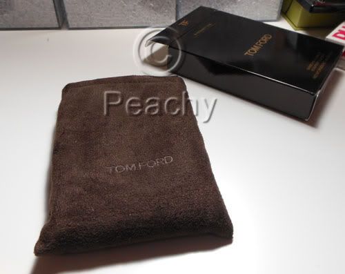
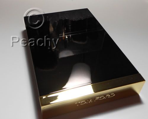
Tom Ford Shade and Illuminate Review

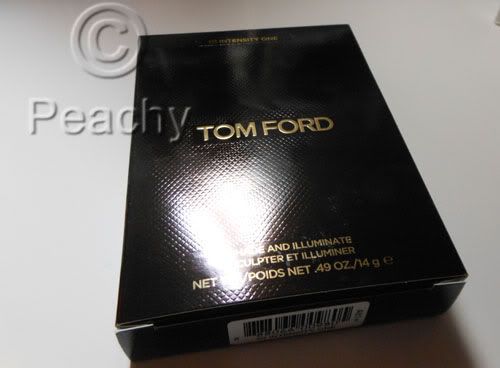
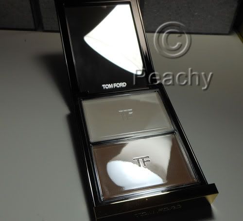
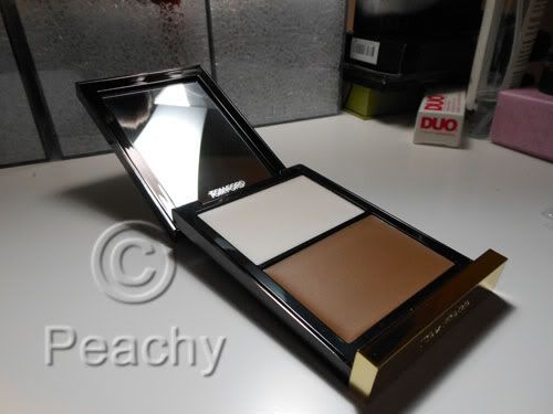
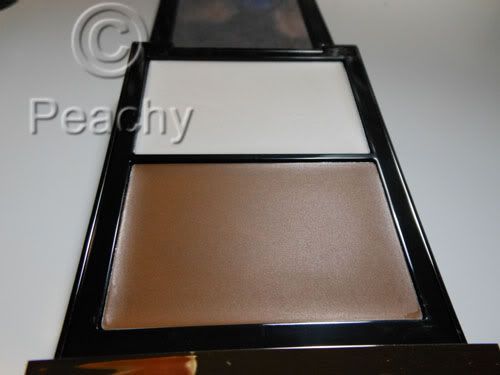
The Shade and Illuminate palette by Tom Ford contains a gorgeous highlighter and contouring cream. The textures are soft and luminous and perfect for creating that Tom Ford sculpted look, or just to subtly enhance your bone structure. Intensity One is the lighter of the two available and it contains a warm brown cream and a glimmering white highlighter. The texture is soft and blends out perfectly, retaining its intensity even as it dissolves into the skin.


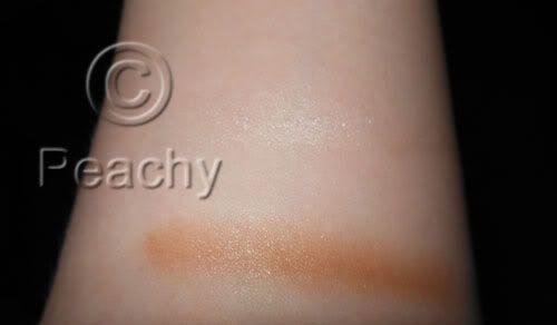
The contour is quite warm, I was worried once I swatched it that it would have the same orangy tone on my super pink fair skin that most "contour" products have, but it blends into the skin so well that it doesn't appear that way on my face. But you can see the warmth in the swatch on my super, super pale inner arm (seriously, I couldn't give you a foundation match for it because there isn't one in most lines; my Bobbi Brown foundation stick in Porcelain is orange against it).


The highlighter is more glimmer than color payoff; paired with the contour it's enough to softly highlight the cheeks, but I think most people would be disappointed by it without the additional contour.


The packaging is, of course, stunning and luxe, hefty in the hand, but not overly bulky. It's the ideal for high end packaging, if you ask me.


The brush (not included) is the like a larger, but proportionally shorter MAC 239 eyeshadow brush. It's soft and dense, but an unusual shape for a contouring brush.


I hope to do a look with this in the next few days, so I'll post a full face picture. In the meantime, however, enjoy these photos.


Monday, October 17, 2011

Halloween: A Dark Fairy Tale Look


This is the first of what I hope will be many Halloween looks I'll be posting, as the only thing I love more than cosmetics is October 31. I'd consider this a gothic fairtale princess sort of look; I think it would suit those hideous short skirted costumes that are everywhere in the Halloween stores these days. You could be any sort of Fairytale princess or character costume, and this look would work, especially if you're not the pink and glittery sort. For someone like Snow White, you'd probably want to go darker and more matte on the lips. Think of this as the anti-Disney princess makeup look.

Eyes:
MAC Paint Pot in Quite Natural, a chocolatey brown, on the lid as a base color; using a brown underneath the black gives a warmer undertone to the black shadows. This was blended out in the crease with MAC Eyeshadow in Folie, which is a reddish brown. Both were applied heavily underneath the eye, too.
MAC Typographic eyeshadow on the lid. I chose this color, not only because it was a blendable black eyeshadow, but because it wasn't the blackest I have. This was applied more heavily at the lash line and blended into the crease. Also, this was applied heavily underneath, and blended at the outer corner to crease a big circular eye shape.
Around the outside of the black, in the crease and underneath, Make Up For Ever 49, a reddish plum color, was blended into the edges.
Make Up For Ever Aqua Black on the upper lash line, upper and lower waterlines. The top was blended with Urban Decay Blackout from the 15 Year Anniversary Palette, and a small amount underneath.
Urban Decay Vanilla (from the same palette) highlighted the brow bone and inner corner.

Ardell Wispies lashes finished off the eyes.

Eyebrows were filled in with MAC Coquette, a grayish brown.

Skin:
Make Up For Ever HD Foundation in 115.
Make Up For Ever Full Cover concealer in No. 4.

Blush:
Make Up For Ever HD Blush in No. 2--a bright raspberry red--as a base, high on the outside of the cheekbone, just under the outer corner of the eye.
The same No. 49 Eyeshadow was applied on top, blending down from the eye.
This was topped with Illamasqua Panic, a cherry red, then everything was blended forward towards the front plane of the face and backwards towards the hairline, but not down.
Contour was NYX Taupe blush.

Lips:
A mixture of Tarte Lipsurgence Natural Lip Tints in Lust, red, and Moody, berry, were applied and blotted slightly, for a dark red tint.